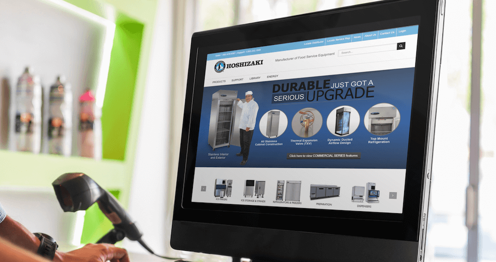
Hoshizaki Website
How do we make information easily accessible to our customers?
The Challenge
Hoshizaki America needed a much-delayed refresh after several years of having a website with a very old layout and design. In addition, Flash was being used in parts of the site. The main challenge, besides the redesign, was making the thousands of manufacturer products more easily searchable for customers.
Our Approach
We first carried out a full performance audit to establish benchmarks. By using Google Analytics, we configured a dynamic dashboard tracking page load times, user behavior, and overall website performance.
Subsequently, the objectives were to:
- - Write clean modular code that implemented a new redesign
- - Add thousands of products in a database optimized for searching and sorting
- - Ensure that website performance was above industry standards
We spoke to staff and customers within the sales process, incorporating their feedback into a finished website that addressed frustrations and improved the overall user experience.
The Results
Since we had already established performance benchmarks before starting, we revisited them to make sure we had exceeded our criteria for success. There was also overwhelming positive customer reviews which was very rewarding for the client
- Category:
Web, E-commerce

